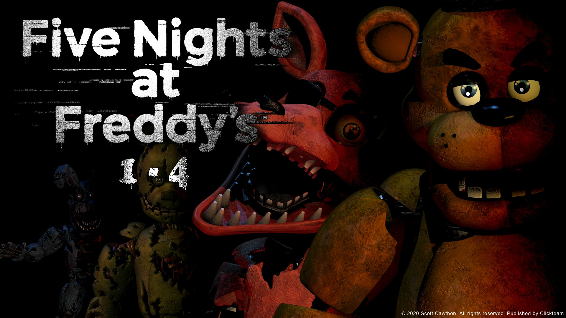
Gaming Editor Louis Wright uses the games of Scott Cawthon as a case study for the importance of developing a consistent atmosphere in a game.
Like any medium, games are designed to evoke a reaction from their audience. Understanding what emotion you want to elicit from your audience is therefore fundamental to good game design. The tone of a game is something that needs to be considered at every point in design, from character creation to level design, to be able to truly immerse the player and break down the divide between the physical and the digital.
The tone of a game is something that needs to be considered at every point in design
A good example of how much one aspect of a game can influence the tone of the complete entity is in the works of Scott Cawthon. In his early career as a game designer, making loosely Biblical games, Cawthon struggled to connect to a younger audience due to the inherently unsettling nature of his character designs. The most pertinent example is that after releasing Chipper & Sons Lumber Co. (2013), reviewers like Jim Sterling criticised it calling the main characters “scary animatronic animals”.
This criticism led to the inception, development, and swift release of Five Nights at Freddy’s (2014) which received immense praise for its atmosphere. The game, taking place in a crude parody of a ‘Chuck E. Cheese’ diner, sees the player take control of a night-guard tasked with watching the animatronic animals roam the pizzeria at night with nothing more than security cameras, doors, and lights to defend themselves against said animatronics, who have gone rogue.
Despite having the same design philosophy between the two games, the characters of Five Nights at Freddy’s (FNAF) are much more fondly remembered and remarkable than those of Chipper & Sons Lumber Co.

Due to FNAF’s nature as a horror game, the more unnerving character designs work incredibly well in developing the game’s atmosphere. They are grungy, creepy, and unsettling; traits that are necessary in making the player feel as though they are in the run-down pizzeria that the game takes place in. Moreover, these designs also work to make the player fearful of these characters. Between both the design and the way they appear throughout gameplay, often standing ominously in shadows staring at the player, the player is given a justifiable fear of the animatronics. They are imposing, and through this, help build the game’s atmosphere and tone.
They are grungy, creepy, and unsettling
In contrast to this, Chipper & Sons Lumber Co. is a family oriented game based around running a lumber mill starring anthropomorphic beavers. Therefore, the character design in this game having the same philosophy as those in FNAF creates a juxtaposition between the character design and the game’s intended atmosphere. While aspects like the environments are designed to be colourful and childlike, the character designs encroach upon the uncanny valley. The game’s design is at odds with itself producing a tone that is confused and messy. This leads to the emotional reaction of the audience to be far from the intent of the design, and the atmosphere of the game to be lost.
Atmosphere breeds immersion
Through a comparison of Five Nights at Freddy’s and Chipper & Sons Lumber Co. the importance of developing a consistent and clear atmosphere for a game is obvious. If the game is not tonally consistent throughout all of its elements then the audience will be left confused on how they are meant to feel at any given moment. Atmosphere breeds immersion; to allow a player to lose themselves in a game, the game has to make them feel as though they are a part of it.
Watch the trailer for Five Nights at Freddy’s here:
Read more articles on game development here:
Rule Introduction in Super Mario

Comments