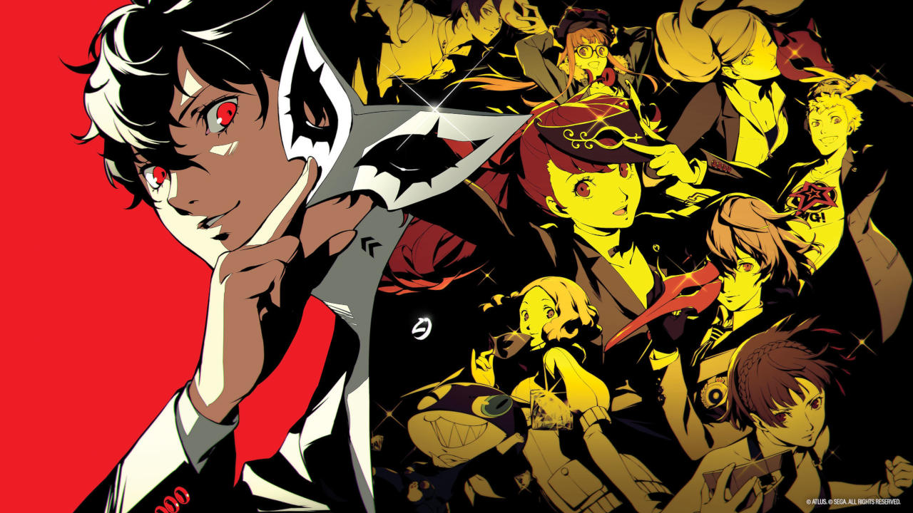
Gaming Editor Louis Wright explores how important a game’s visual identity is to establishing an definitive aesthetic through Persona 5
A large part of ensuring a game’s success is to make it recognisable. If a game has a unique and cohesive style to it, then people will be able to recognise it from even the simplest screenshots. This ensures that the game attracts attention from more people than it otherwise would have; if someone who has not played said game is intrigued by a recognisable style, then they will be more likely to play the game.
Persona 5 crafts its visual identity with bold, striking colours
One such game that takes incredible advantage of producing a distinct visual identity is Persona 5. On the surface Persona 5 crafts its visual identity with bold, striking colours organised in a messy fashion with sharp, angular shapes. This visual style is incredibly attention grabbing and distinctive, not only being capable of catching an audience’s eye at a moment’s notice but also being recognisable to anyone who has already seen it.
Persona 5’s constant usage of this visual style in every regard, from the user interface (UI), to the menus, to even the loading screens reinforces this aesthetic to the user. Even if they may see a similar style in other scenarios or pieces of media, they will instantly be reminded of the game because of how much the game associates its entire identity to its aesthetic. In this sense, Persona 5 may have the strongest association between itself and its visual identity out of any game.

This decision to use bold colours and shapes throughout the game was not purely done for simple visual purposes however, as Persona 5’s style not only looks good but links into the game thematically. At its core, a large part of Person 5 is about rebellion and freedom, breaking away from the traditional norm, seen heavily in the regard of the main characters being a group of teenagers who are the ‘Phantom Thieves of Hearts’. Therefore, by breaking away from traditional UI designs – usually clean, modern, and symmetrical – the game reinforces its themes through its visual design. The player is constantly reminded what the game is about through not only playing through its story, but just going through the menus or walking around its environments. Thanks to this incorporation of the game’s signature aesthetic in all aspects, Persona 5 manages to be cohesive in its thematic presence, its storyline, and its design.
Persona 5 manages to be cohesive in its thematic presence, its storyline, and its design
Persona 5 is a game that manages to be successful in its visual design through a mixture of its chic colour and shape choices, the inspiration and thematic foundation of its artstyle, and its consistency in presenting this style to its audience. All of this ensures that the game will be fondly remembered for its aesthetic, and be incredibly recognisable for both its player base and those only vaguely aware of the game’s existence. Few games, if any, are capable of reaching the level of success that Persona 5 has with its visual design.
Watch the trailer for Persona 5 here:
Read more game development articles here:
Interview: Talking Nikola Tesla with Joel Hakalax of ‘Close to the Sun’

Comments